Creative Work
Q-TEC, INC. - ColorEdge Used for Production of the Hit Anime "Violet Evergarden"
ColorEdge PROMINENCE CG3146 Used for the Final Color Checks for Violet Evergarden: the Movie in Dolby Cinema
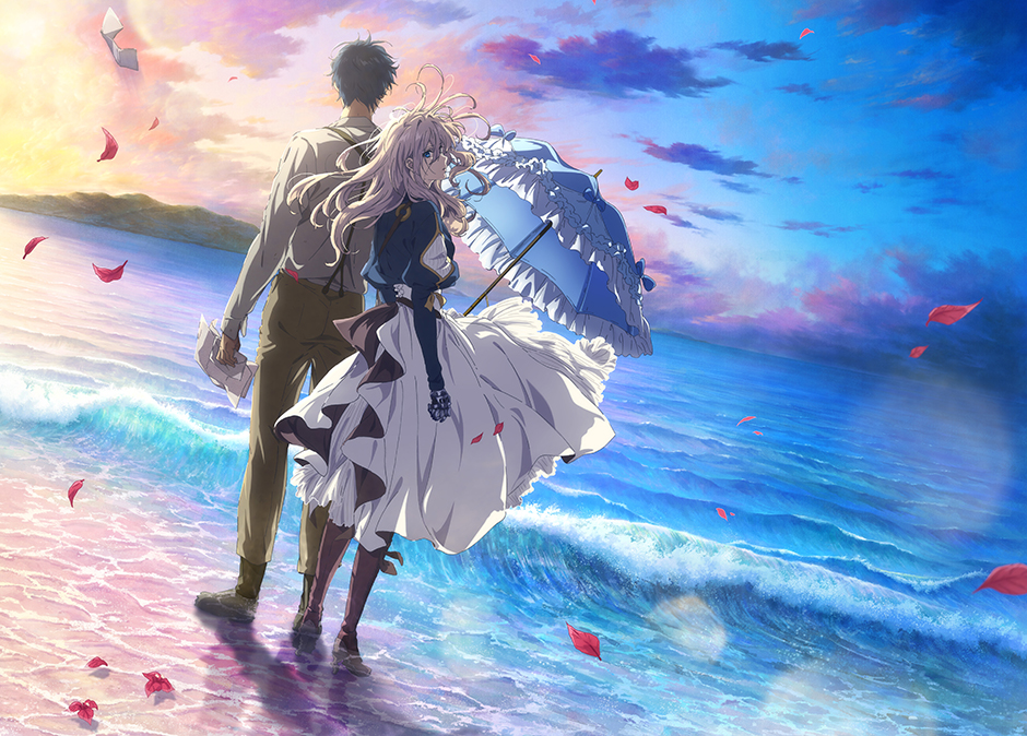 ©Kana Akatsuki, Kyoto Animation / Violet Evergarden Production Committee
Kyoto Animation’s big hit, Violet Evergarden: the Movie, is the first Japanese animated feature film to be released in Dolby Cinema format, and the movie’s visual beauty has captivated audiences. Dolby Cinema refers to a particular screening environment that combines Dolby Vision for HDR (high dynamic range) with its vivid, wide-gamut color and deep contrast, and the Dolby Atmos sound system for more immersive sound. The HDR color grading and upconversion for the Dolby Cinema release of this movie were handled by Q-TEC, and the ColorEdge PROMINENCE CG3146 was used for simulation grading and director checks. We talked to Taichi Ishidate, director of Violet Evergarden: the Movie, as well as Makoto Imazuka, senior colorist and general manager of Q-TEC’s Technical Promotion Department, about their production workflow and their impressions using the CG3146.
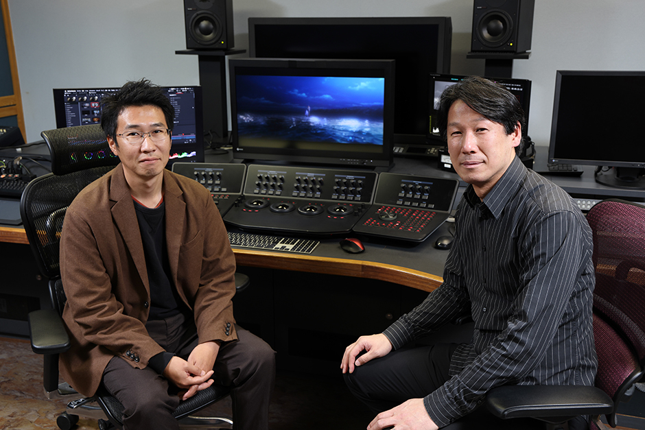 Left: Taichi Ishidate (director)
Right: Makoto Imazuka (Q-TEC, INC.)
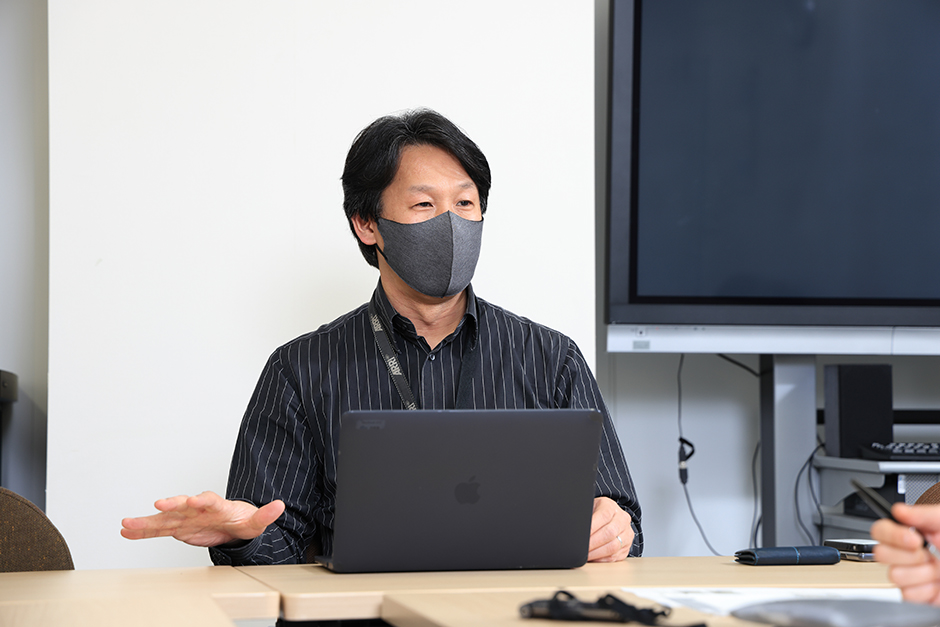
This interview took place in December 2020. Appropriate health measures were taken, including masks worn by interviewees, for the safety of all involved.
What inspired you to release a Dolby Cinema version of Violet Evergarden: the Movie?
|
Ishidate: After the release of the standard version, Mr. Matsutake from our distributing partner proposed the idea to us. We decided to test it. I’d never seen anything in Dolby Cinema, so my understanding of it was just a vague sense of something like “higher image quality”. As a creator, I was worried that by going back and reworking a finished project, we might wind up straying from the artistry and vision of the original work. However, I thought that I should give it a chance if it would allow us to further deliver on the original artistic vision. When I saw the short test video from Q-TEC, I was convinced that they fully understood my vision for the movie, so we moved ahead. |
 |
 |
Imazuka: You really have to see it yourself to understand it, so we made a comparison video to demonstrate. I was concerned that the standard and Dolby Cinema versions might wind up creating different overall impressions. Therefore, I wanted to take advantage of the detailed shadows and highlights that Dolby Cinema excels at, for a more natural feel compared to the usual intensity of 4K HDR. This was an interesting challenge for us, because it was our first 4K HDR conversion of a new animated feature film. |
Tell us about how the actual process works.
Ishidate: We started to work on this in October. After the test, when I took another look at the specific adjustments that were made, it was only then that I noticed the broad variety of effects and the range of visual balance from scene to scene. Essentially, Mr. Imazuka’s minute color grading work for each scene made it possible for us to take advantage of the benefits of Dolby Cinema, while still retaining the feel of the original work. This high quality provides the added value that moviegoers desire when they pay extra to see the Dolby Cinema version. It’s a testament to all the hard work by Mr. Imazuka and everyone else who contributed to the technical aspects of the project.
|
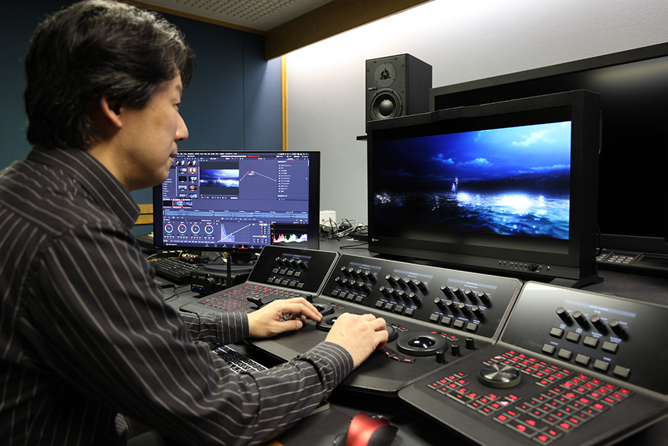
Imazuka: For this project, we used Rio by Grass Valley for the editing, with DaVinci Resolve by Blackmagic Design as our color grading tool. Our monitor was an EIZO CG3146. The workflow began with an upconversion from 2K SDR to 4K HDR. Usually, you take a 1,000-nit 4K HDR master, then screen it in Dolby Vision, but in this case, we only had the 2K SDR version. So, we had to make a 4K SDR version first. This was directly converted at 108 nits. It was better to start from this original and create an image that fit the artistic vision, rather than first producing a 1,000-nit version and then converting it to a 108-nit version. I'd never used this workflow before, but I believe that it allowed us to optimize the brightness for Dolby Cinema in the truest sense. |
|
What were your impressions from using the ColorEdge PROMINENCE CG3146 HDR reference monitor?
Imazuka: We used the EIZO CG3146 as a reference master monitor for simulation grading and director checks. We already confirmed that the CG3146 does what we need, like proper display of bright areas and smooth gradations, so we knew that it demonstrated the quality necessary for HDR reference use. As the director, Mr. Ishidate was particularly concerned about rendition in shadows. We selected the CG3146 because we felt that an LCD with an anti-glare panel would be ideal for reproducing dark gradations, so we could check the color reproduction in the shadows and crisp blacks to take advantage of Dolby Cinema’s strengths. Even subtle color differences could have major effect on the impression in the final, and the shadows are a major element of this movie, so I wanted to make sure the monitor could display them realistically. And I think that, with HDR, the monitor is even more important.
Ishidate: In that sense, I think that the monitor is a vital element in producing a theatrical release. For TV production work, every viewing environment will be different — you don’t know whether people will be watching on an OLED or LCD TV, or even on a CRT. But for movies, at least for movie theaters, and in this case for Dolby Cinema, you have a much clearer target that you’re producing for. So the closer we got to the final, the more we felt we would be delivering an enjoyable experience directly to audiences.
Tell us what you set out to achieve in terms of expression with 4K HDR.
Ishidate: I knew that HDR expands the dynamic range of both highlights and shadows, but this movie takes place before the widespread adoption of electricity. This means that there are a lot of scenes lit by candlelight or natural light, as well as dark scene. So we were much more concerned with how the shadows looked. I had the highlights in certain areas tweaked slightly, such as the dim city lights and the sparkling reflections of the sun on the surface of the sea. When I saw it in a theater, I was impressed by the rendition in the shadows, especially in the backgrounds. Before I always felt that even if scenes looked fine on our production monitors, it’d feel like the shadows were crushed or kind of indistinguishable when shown in theaters. In this case though, it felt much closer to how the movie looked on our monitors, with every detail coming through. So, in that sense, I think that watching the movie in Dolby Cinema offers an experience that is truer to the production team’s artistic vision. As for the 4K aspect, usually animation is drawn on roughly B4-sized paper, then enlarged to fit to the screen size. This usually creates a sense that it’s kind of “stretched out,” so I was pleased to find that it didn’t feel that way in this case.
Imazuka: We received two instructions from the director. First, the 4K upconversion must have the same feel as the original HD version. For the conversion, we used FORS EX PICTURE high-definition conversion technology, but we avoided overemphasizing the outlines and overdoing the “4K look.” Rather, we just removed the slight compression noise around the outlines and the YUV color artifacts. The art was incredibly beautiful to begin with, so we wanted to do what we could to avoid harming it in any way. This movie also used the unique stylistic technique of colored outlines. We worked to upscale it with a natural feel, retaining these colored outlines that made the original art so distinctive.
Second, the overall balance of the animation must be kept intact, even in HDR. So, we adjusted the brightness to create a sense of depth and immersion without distracting from the story being told. More specifically, we adjusted the brightness in some scenes based on Mr. Ishidate’s direction, as well as in other scenes based on my own suggestions. In particular, the scenes that we adjusted based on his instructions, like the “breather” moments around scene changes, before the story moves on — adjusting these sorts of scenes provided a chance for audiences to subtly enjoy the HDR experience along the way. Seeing those changes gave me a feel for his keen sensibilities as a director. The background art is also especially beautiful, with a sense of dimensionality that really draws you in. If the lighting is too strong, that can destroy your sense of immersion in an instant, so we were incredibly careful when working on the highlights. We made sure not to touch the lighting from the sun or the lighthouse. We used the HDR effects to subtly draw viewers into the world of the movie and its distinctively beautiful art.
What were some of the challenges you faced during the production process?
Imazuka: We had trouble with the shadows. Dolby Cinema shows even more detail in the shadows than I expected. This also brings out the outlines. So, we received a difficult request from the director, for thin, soft outlines. On my end, I applied some band-pass filtering to the outlines, and created three more parameters to apply to each scene. The result was clean, free of noise and artifacts, but for this movie, a sense of ambiguity is key. I put a great deal of effort into ensuring that that feel wouldn’t be lost. I didn’t get director approval until the very last minute, and that came as a huge relief. [laughs]
Ishidate: Animation as a technique involves using pencil lines and crisp, dark colors — but not completely black — for outlines that delineate the boundaries, and these are used to create movement. Artists overlay backgrounds and cells (characters), and different forms of expression to produce a single image. For this movie, I wanted to try dissolving that boundary to create a single unified space, a single unified worldview, so there are colors mixed into the outlines. But the crispness of the shadows makes the boundaries more distinct… It felt very “two steps forward, one step back.” This made the discussions pretty weird at times. [laughs]
Imazuka: I felt that it should be more than a matter of just being able to clearly make out the shadows. Our top priority was to preserve the feel of the movie, so we really wanted to figure out what to do about the outlines in order to feel confident that the movie was ready for Dolby Cinema.
Tell us about the effects of 4K HDR.
 |
Ishidate: It doesn’t sound like much, but I like the way that 4K HDR makes it easier to see small details like tears welling up in someone’s eyes, even outside of close-ups. There were a lot of places where the artistry and Dolby Cinema complemented each other perfectly, and because of the movie itself, I think that a lot of people were interested in seeing how the 4K HDR approach affected the feel of the movie. Imazuka: Violet Evergarden: the Movie is absolutely worth seeing in Dolby Cinema. The shadows in this movie are especially beautiful; just a joy to behold. Working on this movie was an education in the importance of shadow detail and how to create nuanced shading. The waveform monitor information isn’t enough — you really need an HDR monitor that lets you check it with your own eyes. |
How do you think 4K HDR will change the expressions of animation?
Imazuka: I’m currently working on older live-action and animated features from traditional film. Film stores a huge amount of information, and 4K HDR marks the first time I’ve felt like we might be able to get everything out of the film. The wider color gamut also makes it possible to do new things that weren’t possible at the time — even old movies can feel “new” again. This was my first time working on a new animated feature, and it was clear to me just how important the shadows are. We had to upconvert from 2K to 4K, so maybe you can’t call it “pure 4K,” but I think that the picture quality is plenty good, and there’s more potential in the future. We can provide follow-up to handle the parts where the main production process has trouble keeping up with the 4K transition. I hope to be involved in other 4K HDR projects in the future.
Ishidate: Directors like myself, as well as the people involved in background art, finishing, and color design, have been working to develop a deeper understanding of the expressive potential of color gamuts. I think that we need to explore the possibilities created by new technologies like Dolby Cinema. In this case, the standard version of the movie was already completed, which made it easier to predict how to make the effects work on shadows, but there may still be more to pursue in other aspects of the movie. In that sense, I feel like we are faced with a large challenge. I think it adds another element that we need to think about, but in a good way. Things like, how do we make movies now that there’s 4K HDR? There are also studios that employ fully paperless illustration, and the animation production industry is going through a period of change, so it’s up to production companies to decide how much they can handle. I look forward to seeing what new possibilities these new technologies offer.
Violet Evergarden: the Movie – Official Website (Japanese)
Q-TEC, INC.
Deployed Product